SiloSys Mobile is an application designed to support producers and administrators in managing the storage process. In this case study, I focus on redesigning its ticket management flow to make operations more efficient. The goal was to simplify complex tasks, reduce errors, and improve the overall experience for managers and the industry.
The system was facing two key challenges: limited ticket capacity for different types of transport, and a confusing process for managers who struggled to complete tickets efficiently. These issues created delays and increased the risk of errors in daily operations.
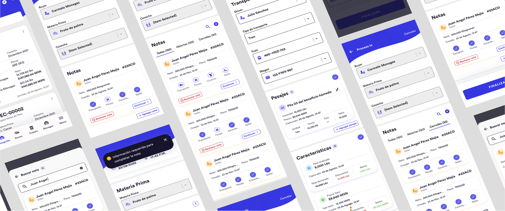
The app currently handles a limited number of tickets per process. The goal is to increase ticket capacity while managing a variety of transport methods (such as trains, trucks, or even wheelbarrows) for both incoming and outgoing operations.
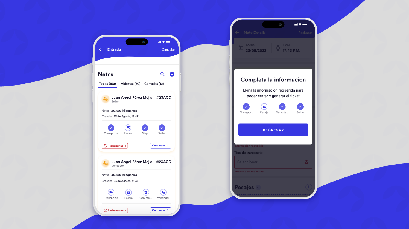
Managers process multiple tickets each day, but often face challenges. The information required can feel confusing, and completing a ticket—such as finding the correct button to finalize it—is not always straightforward.
During meetings with clients on field, we identified the need to enhance the system’s capabilities to handle up to 150 notes per process and problems to complete the required information on tickets.
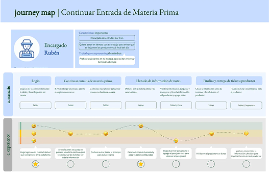
We conducted field observations to observe real-time interactions with the app. These findings were supplemented with usability testing with Maze to validate the user flow related to completing notes.
As a result of this research, we identified the following key pain points:
Restructure with a new information architecture to categorize the fields and all the data to simplify the process, resulting in four main categories:
Implement icons in the main information to know the structure of notes and progress to know what information is missing.
Steppers to drive users trough the note to fill the required information and complete the note.
Categorize the status of the notes with tabs (all, open, close, rejected).
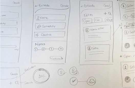
I refined the prototype with new insights from the tech team and stakeholders in order to get a better result aligned with the tech and clients needs. Given as result the next prototype.
See LoFi Prototype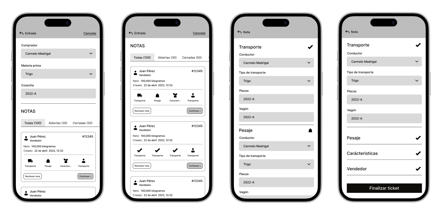
I documented flows, new architecture and components to share with the team and follow a clear process to develop.
User testing was essential in measuring the success of the redesign. With the updated design implemented for the current season, we used Maze to evaluate the new flow and track error rates. The results showed a 30% reduction in time on task and an 80% task success rate.
My take away
This project allowed me to explore tools like Maze, gaining valuable insights into user behavior remotely. It reinforced the importance of empathetic, thoughtful design in solving real challenges across industries.