Diveces is a Mexican architecture firm with a strong track record of successful projects. They needed to improve their website, which was outdated, non-responsive, and no longer reflected their core values of simplicity, creativity, and professionalism.
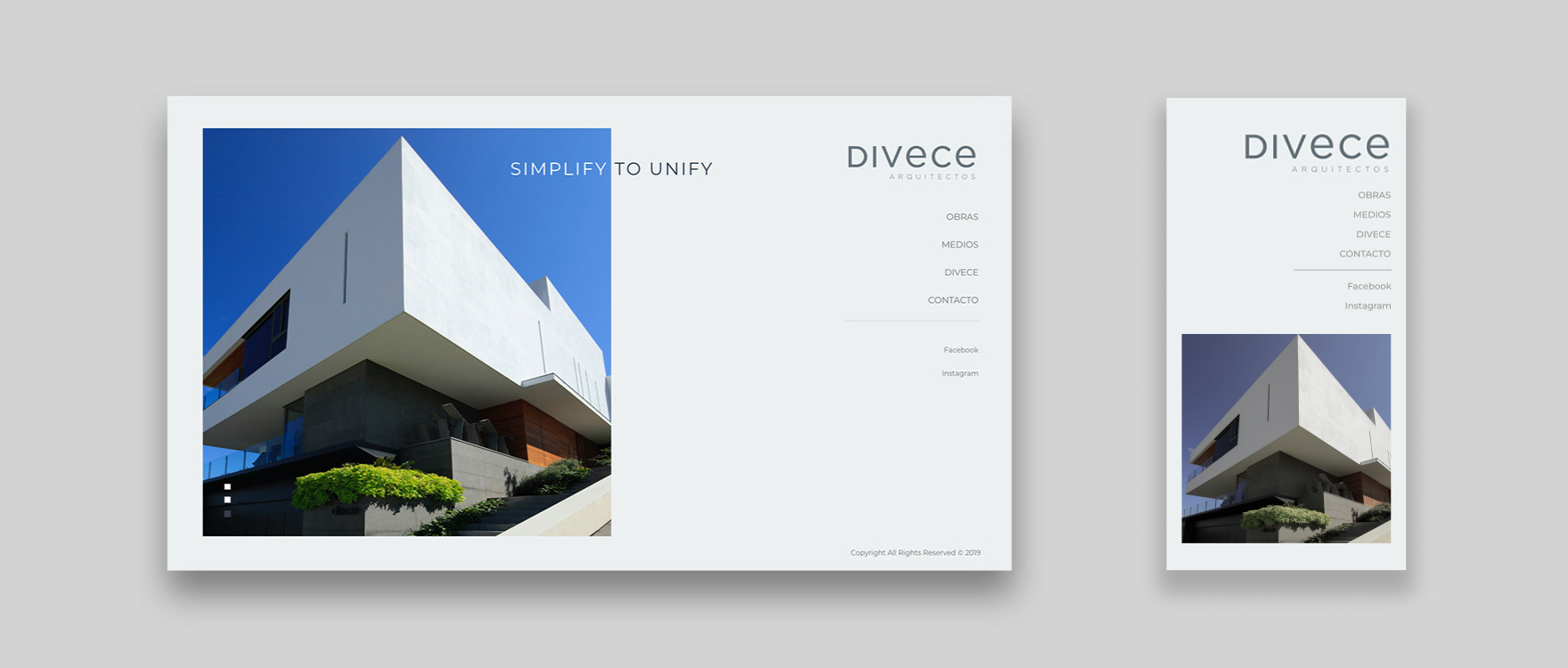
The firm wanted a website that would serve both as an online portfolio and as a presentation tool in meetings with future clients—accessible seamlessly from any device.
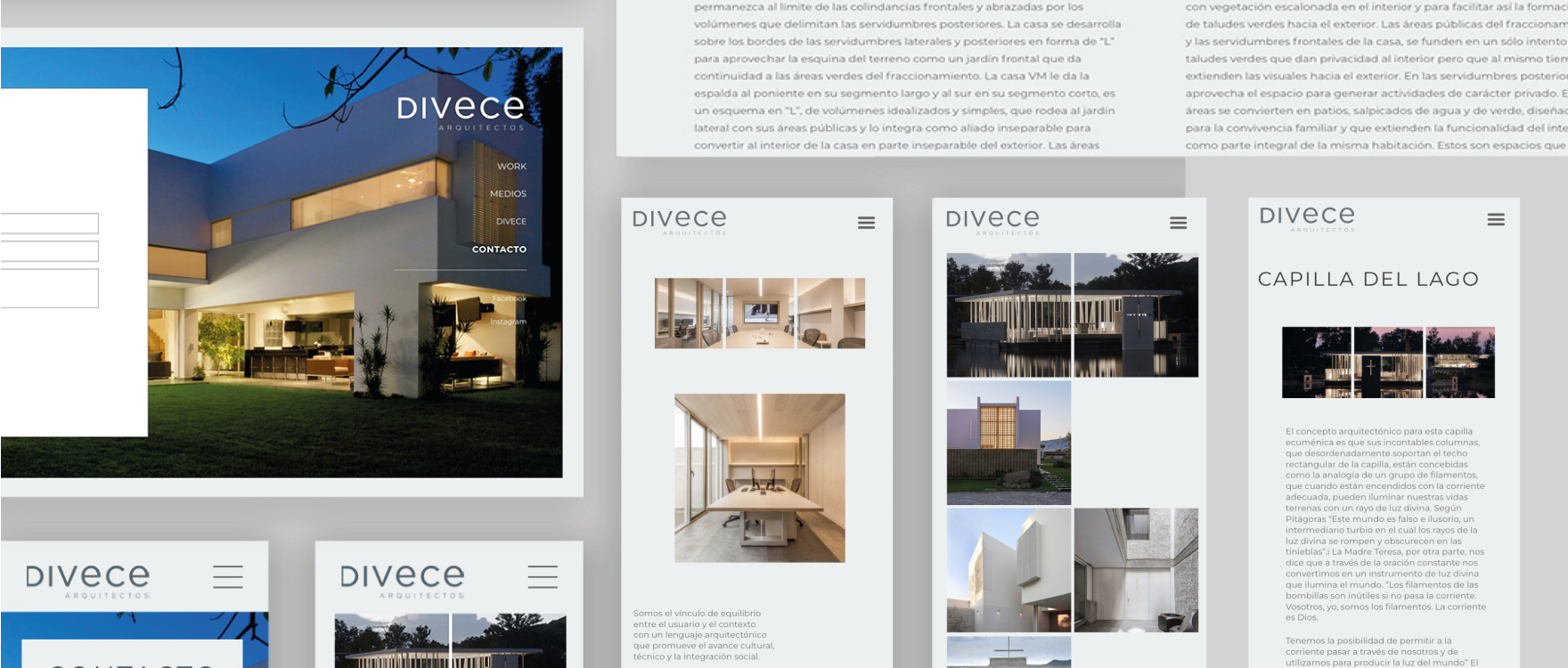
While designing a project gallery might seem straightforward, the real challenge was aligning the website with the firm’s brand identity and unique style, while avoiding a static or uninspiring design.
“Designing Spaces, Elevating Experiences”
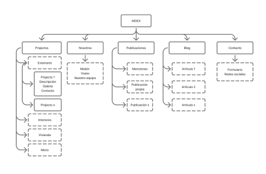
I defined the site structure with an intuitive sitemap and simple navigation that allows users to learn more about the company. The goal was to highlight its new brand identity while showcasing its legacy through a project catalog designed to inspire trust and invite collaboration.
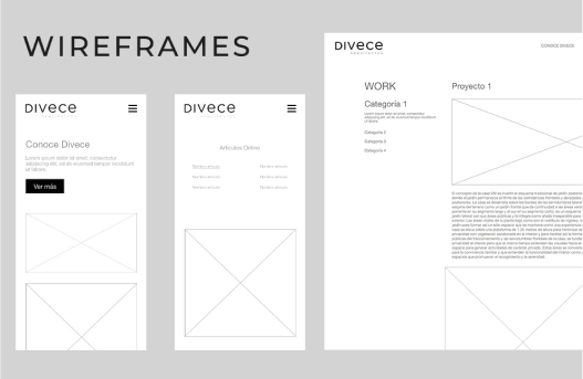
The foundation of the design system was built on intuitive navigation, simple geometric shapes, and a neutral color palette. Inspired by architectural minimalism—simplicity, functionality, and visual clarity—the approach focused on reducing elements to the essentials to create a calm and balanced user experience.
By leveraging white space, applying neutral tones with subtle variations in saturation to establish hierarchy, and using squares as the simplest structural form, the design system achieved both elegance and consistency across components.