Cautin is a structural engineering company with extensive experience and an important role in creating structural analysis and design projects.
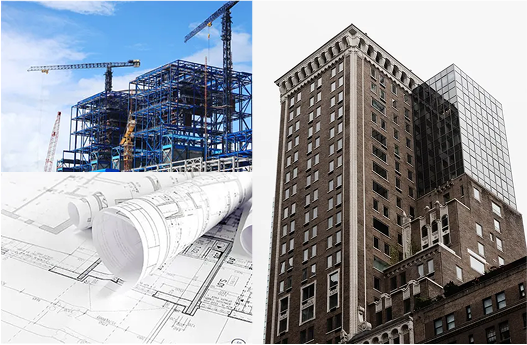
They needed a brand image that would reflect their professionalism, strength, and the dynamism with which they work—both as part of their brand identity and their visual communication. For my creative process, I created a mood board with construction photography and engineering elements, providing visual references in form and style for the branding.
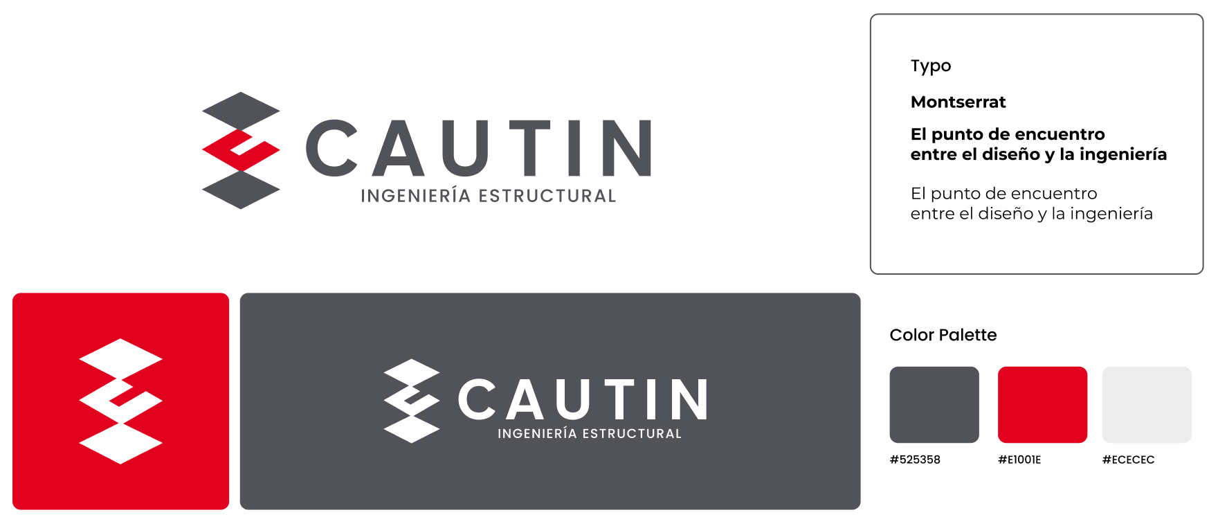
As part of the design team, we developed a brand composed of three geometric elements joined at the edges, resembling a three-level structure. At the center, we placed the letter “C” to reinforce that Cautin is a solid foundation for structural engineering.
A semi-bold geometric sans serif typeface was chosen to create a simple, strong structure that conveys reliability and professionalism.
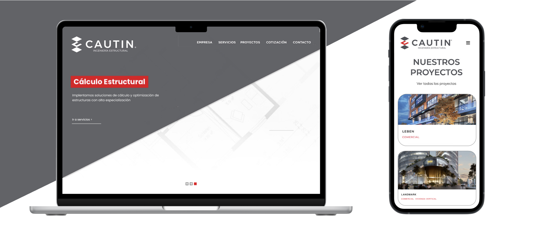
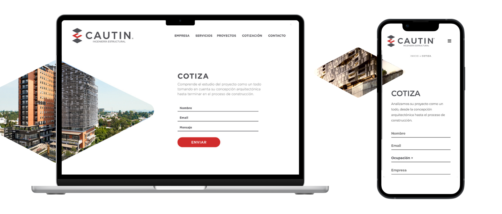
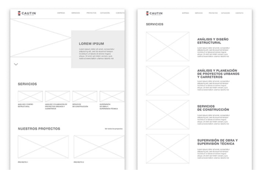
I defined the site structure with an intuitive sitemap and simple navigation that allows users to learn more about the company. The goal was to highlight its new brand identity while showcasing its legacy through a project catalog designed to inspire trust and invite collaboration.
To make the most of the new visual identity, elements from the logo were used as auxiliary resources to shape the interface design. These graphic elements served as the foundation for defining visual patterns, icons, and consistent components, reinforcing the brand’s personality in the digital space.
From a technical perspective, a modular and scalable interface was designed, based on a component system that ensures consistency and flexibility for future updates. Careful attention was given to legibility, color contrast, and visual hierarchy to deliver a clear, professional experience aligned with accessibility standards.
The result is a UI that not only reflects the company’s strength and dynamism but also provides intuitive navigation and efficient interaction for its users.